BLOG
Interior stories to inspire, nurture and make you feel good...take 5 minutes for some self-care, cuppa and a little mindful reading...
Colour Psychology: Painting Your Way to Happiness
Colour Psychology - Painting Your Way to Happiness, Home interiors that bring joy!
Ah, February. The month when we ditch the dreary tones of January and embrace a little colour therapy. It’s not just our wardrobes that need a pop of joy; our homes deserve it too! Let’s dive into the transformative power of colour psychology, where science meets interior design, and learn how you can use it to make your home not just look incredible but feel like a haven of happiness.
The Science of Colour and Mood
Colour isn’t just for aesthetics—it’s a powerful mood influencer. Ever noticed how a green room makes you feel calm, or why fast-food chains love red? It’s not accidental. Colour psychology studies how different hues affect our emotions and behaviours, and the results can be mind-blowing.
Blue: Calm, serene, and great for bedrooms or bathrooms where relaxation is key.
Yellow: Energising and cheerful—perfect for kitchens or home offices.
Green: A balance between calm and energising, making it ideal for living spaces or any room where you want to feel grounded.
Red: Bold and stimulating, great for dining rooms to encourage appetite and conversation.
Pink: Soothing and nurturing, often used in bedrooms or cosy corners.
Neutral tones: White, beige, and grey offer a clean slate, but too much can feel stark—layer them with colourful accents to avoid feeling like you live in a hospital waiting room.
Room-by-Room: Colour Strategies for Your Home
Here’s a guide to weaving colour psychology through each space in your home:
Bedroom: Peaceful Retreat
Opt for colours that promote relaxation and calm. Blues, soft greens, and lavender hues are fantastic choices. Avoid fiery reds or neon yellows unless you enjoy insomnia.
Add pastel-toned cushions or a calming blue throw to your bed.

Kitchen: Energising Hub
Inject vibrancy with splashes of yellow, orange, or even lime green. These colours boost energy and positivity—handy when you’re chopping onions at 7 a.m.
Brightly coloured bar stools or a cheerful set of tea towels.

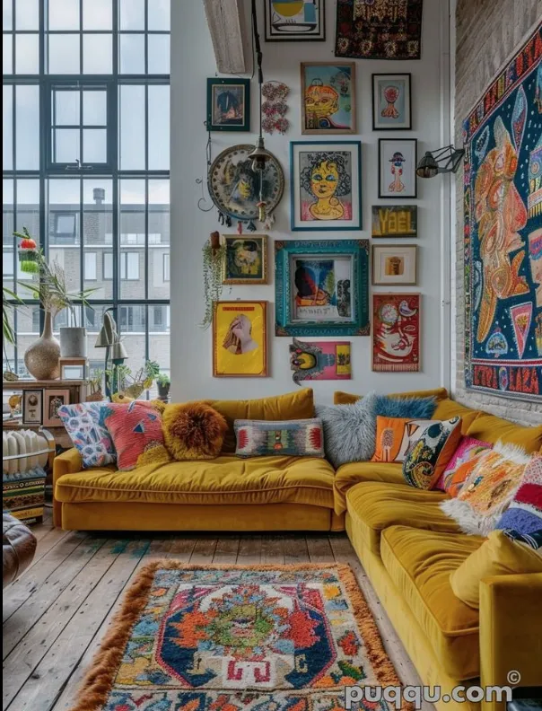
Living Room: Versatile Comfort
This multi-use space should feel welcoming yet adaptable. Green tones bring balance, while warm neutrals add comfort.
Hang artwork featuring earthy tones or add green-hued scatter cushions.

Mood-Boosting Quick Fixes
Not ready for a full-scale redecoration? Fear not! Small, intentional changes can make a big difference.
Throws and Cushions: Swap out textiles seasonally. Add warm, rich tones like mustard or terracotta in winter and brighter hues in spring.
Artwork: Choose pieces with colours that evoke the mood you want—be it calming, energising, or joyful.
Rugs and Curtains: These larger textiles anchor the room. Experiment with colour or patterns to bring personality to neutral spaces.
Accessories: Lampshades, plant pots, and vases are easy ways to introduce pops of colour.

Why It’s Worth the Effort
Painting your walls isn’t just about impressing guests; it’s about creating a space that supports your mental wellbeing. After all, if a soft yellow wall can make you smile on a dreary Monday, isn’t it worth the brush strokes?
So grab a paint swatch or two (or ten) and start planning your home’s mood-enhancing makeover. Just remember: it’s not about trends, it’s about what makes you feel good.
If you’re intrigued by the magic of colour psychology and want to dive deeper, join my 10 week Wellbeing Interior Design Course starting February 25th in Cheltenham at The Isbourne or Online February 26th. Together, we’ll transform your home—and maybe even your Mondays.


FREE DOWNLOAD
Download my blogs on the go...
Take 5 minutes out of your day for some well deserved mindful reading...
© Copyright 2024 Wanderlust Home Designs